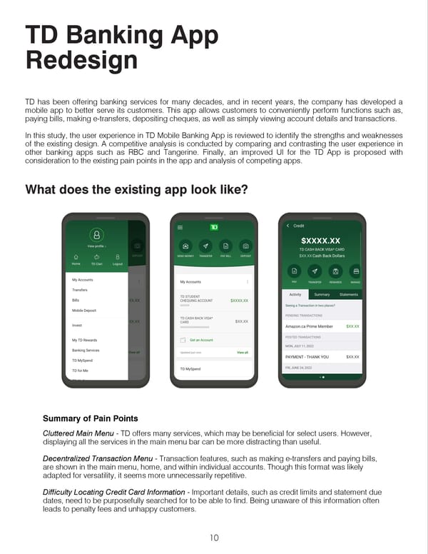
TDBankingApp Redesign TD has been offering banking services for many decades, and in recent years, the company has developed a mobile app to better serve its customers. This app allows customers to conveniently perform functions such as, paying bills, making e-transfers, depositing cheques, as well as simply viewing account details and transactions. In this study, the user experience in TD Mobile Banking App is reviewed to identify the strengths and weaknesses of the existing design. A competitive analysis is conducted by comparing and contrasting the user experience in other banking apps such as RBC and Tangerine. Finally, an improved UI for the TD App is proposed with consideration to the existing pain points in the app and analysis of competing apps. Whatdoestheexistingapplooklike? SummaryofPainPoints Cluttered Main Menu - TD offers many services, which may be beneficial for select users. However, displaying all the services in the main menu bar can be more distracting than useful. Decentralized Transaction Menu - Transaction features, such as making e-transfers and paying bills, are shown in the main menu, home, and within individual accounts. Though this format was likely adapted for versatility, it seems more unnecessarily repetitive. Difficulty Locating Credit Card Information - Important details, such as credit limits and statement due dates, need to be purposefully searched for to be able to find. Being unaware of this information often leads to penalty fees and unhappy customers. 10
 Portfolio 2024 Page 9 Page 11