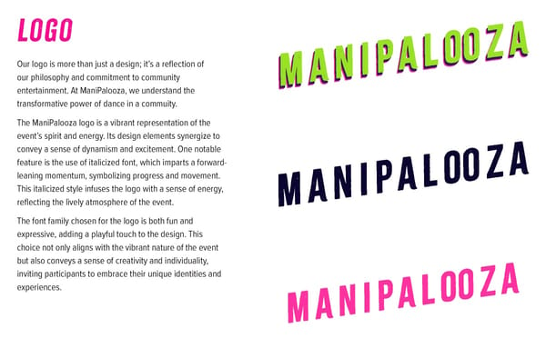
logo Our logo is more than just a design; it’s a re昀氀ection of our philosophy and commitment to community entertainment. At ManiPalooza, we understand the transformative power of dance in a commuity. The ManiPalooza logo is a vibrant representation of the event’s spirit and energy. Its design elements synergize to convey a sense of dynamism and excitement. One notable feature is the use of italicized font, which imparts a forward- leaning momentum, symbolizing progress and movement. This italicized style infuses the logo with a sense of energy, re昀氀ecting the lively atmosphere of the event. The font family chosen for the logo is both fun and expressive, adding a playful touch to the design. This choice not only aligns with the vibrant nature of the event but also conveys a sense of creativity and individuality, inviting participants to embrace their unique identities and experiences.
 MP Branding2024 Page 4 Page 6